
In the last year or so, adding a dark mode toggle to websites is a trend that has exploded for personal blogs and big brands. Thanks to some browser features and system APIs dark mode has become easier than ever to implement. I recently added this feature to my own site, and here are some things I learned along the way.
What even is Dark Mode?
"Dark mode" refers to a light-on-dark color scheme, or one where the background is a dark color with light text and graphics. This aesthetic has always been popular for applications like terminals and code editors, but has been making a comeback in more mainstream user interface design.
Where did Dark Mode come from?

If you look back on the history of computer interfaces, light text on a dark background is originally how computer interfaces initially appeared. This had to do with the physical hardware limitations of computer monitors — cathode-ray tube displays were black in the off position and would use beams of colored RGB light to "paint" text and graphics onto a screen. Some of the earliest computer displays used only a single color to paint vector graphics on to primitive screens.

As computers became more powerful and interfaces more sophisticated it was easier to fill entire screens with light. The first consumer graphical user interface (or GUI) was introduced by Xerox in 1973 and light themed interfaces have been the norm in home computing ever since. My best guess for why this trend is that with the rise of home desktop publishing users were more comfortable working with an interface that resembled paper.
By the early 90s, computers were becoming a fixture in most homes almost all GUIs were in full color. Many of these operating systems allowed users to pick from predefined lists of themes to recolor their interfaces, some of which were light-on-dark styles and some of which were dark-on-light styles.
Modern Dark Mode
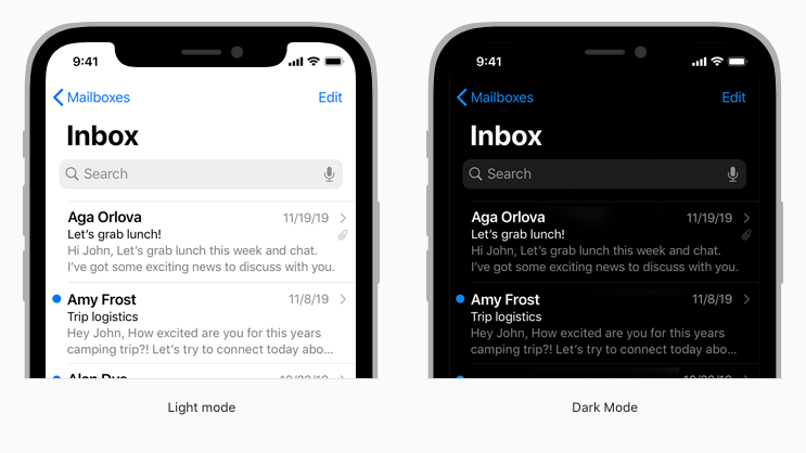
What we think of as "dark mode" today really took off around the end of 2019. Apple introduced a system-wide preference for dark mode on desktops with their Mojave OS and for handheld devices with iOS 13, and Android did the same with Android 10.
It has always been possible to create a custom theme implementation for a website or application using some combination of CSS and JavaScript. A big change to web development came in 2020 when all major web browsers began supporting the prefers-color-scheme media query. This is a flag that is passed from a user's operating system level preference into the browser, and CSS could check to see what that preference was and make decisions based on it. Along with the addition of CSS variables, web developers were granted a powerful set of tools to dynamically change styles based on these user preferences.
Why should a site support Dark Mode?
For Eye Health
Although the facts seem to be debated, many users claim that using a dark theme reduces strain on their eyes. There does seem to be evidence that this is contextually true — light themes make sense for bright environments and dark themes for dark environments. There is also evidence to suggest that when using screens immediately before bedtime, a dark theme will reduce the amount of blue light the eyes take in and make it easier to fall asleep.
For Less Energy Consumption
Less debatable than the topic of eye strain is the fact that with certain screen types using a dark theme can conserve energy. This is because not having to light up background pixels with white light can lead to less battery usage. As more and more devices are built with OLED screens this can add up to huge savings over time and at scale. Users can consume less electricity, charge their phones less, replace their batteries with less frequency, and overall have a positive effect on the environment.
Just Because
The most important, in my opinion, is to honor a user's choice. In fact, that ethos is baked right into the design of CSS.
The user (or reader) of the web site can choose to override styles in many browsers using a custom user stylesheet designed to tailor the experience to the user's wishes.
While there may not be science to confirm that it is actually better for your eyes, many people prefer using sites with light text on a dark backgrounds. Letting users customize their experience is core to the web platform, and if a site can let them choose their color theme without having to write a custom style sheet, it should.
Dark Mode isn't for Everybody
Dark mode is certainly popular right now, but there are still a large number of people who prefer to read dark text on a light background — and that's okay! There are many medical reasons why a person might want to stick with what has been a more traditional color scheme.
With the tools currently available for the web platform it's certainly possible to let users make choices about how they want to view content.